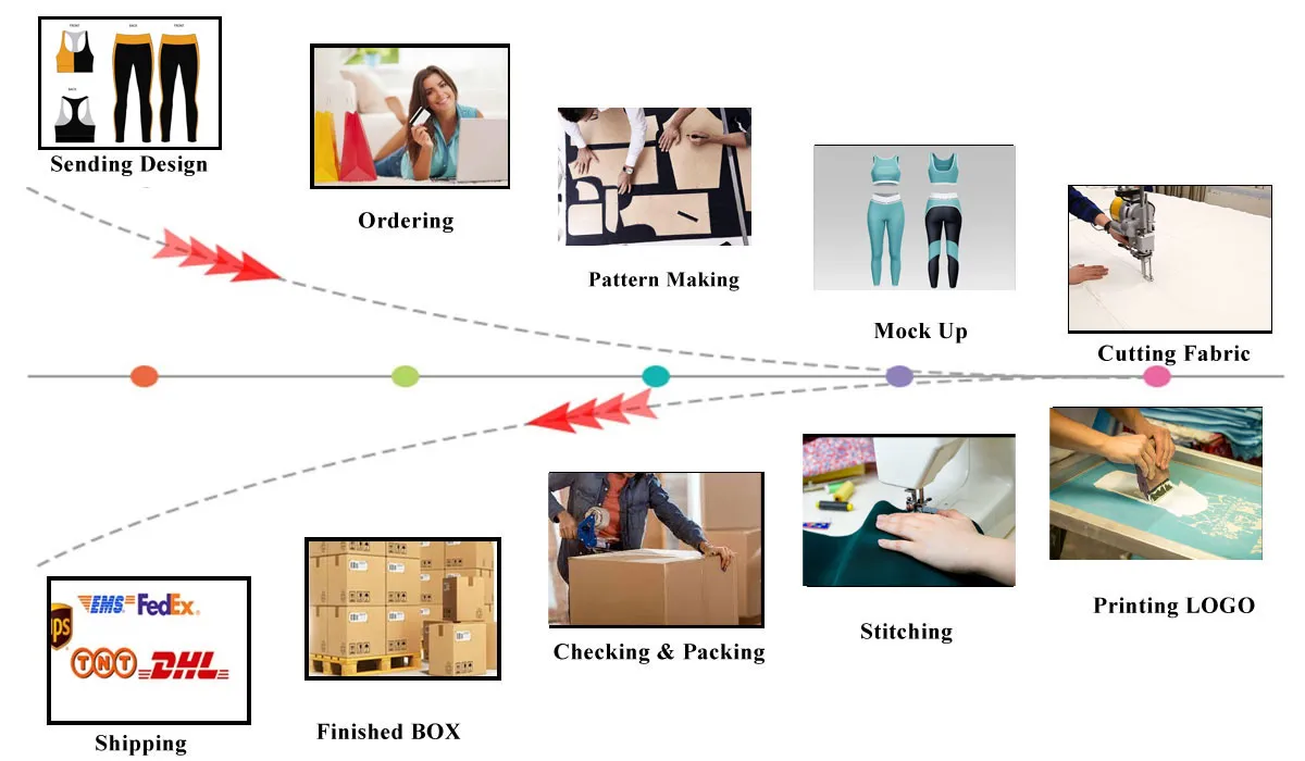
If you think only fabrics and layouts dictate the final outlook of a garment, then you are absolutely wrong! What is the first thing you notice about someone’s outfit? It’s not the garment type or even those nifty printed designs but the actual colors of said garments.
Take some time and think about it.
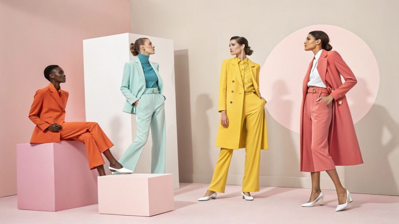
- Since colors are what decides our initial impression more than psychological, there has to be some importance to color theory for fashion, right? Hear this: colors are what determine how your clothes will look.
- Imagine two hoodies side by side, one being bright red and the other scarlet red. Chances are you would find scarlet hoodies to be more sophisticated and premium.
Join us on this blog to discover how colors can be used in the fashion industry and why a wrong choice can totally mess up your wardrobe or selling collection.
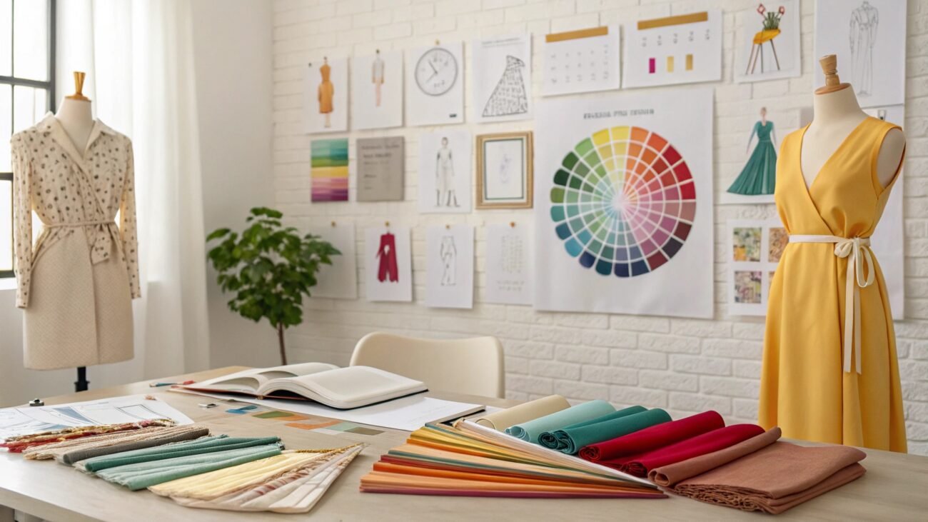
What is Color Theory in Fashion Designing?
Color theory is a set of colors pre-determined to evoke emotions and attract interest. However, when we talk about it from a fashion designing perspective, it becomes a sort of framework from which designers intentionally pick color palettes or even combine them to create aesthetically successful fashion.
For Example, Colors such as navy blue and olive green can impart a sense of sophistication and peacefulness, whereas hot colors such as bright red and yellow link to energetic vibes and excitement.
Now, you may have a basic gist of how colors affect the perceived value of garments, and to create a brand’s image without spending thousands on top-notch quality products and expensive manufacturers, you can instead take your time and think about what value you want to provide your customers.
Afterwards, you can find resonating colors and design your clothes around that scheme to get enough crowd attention for your brand.
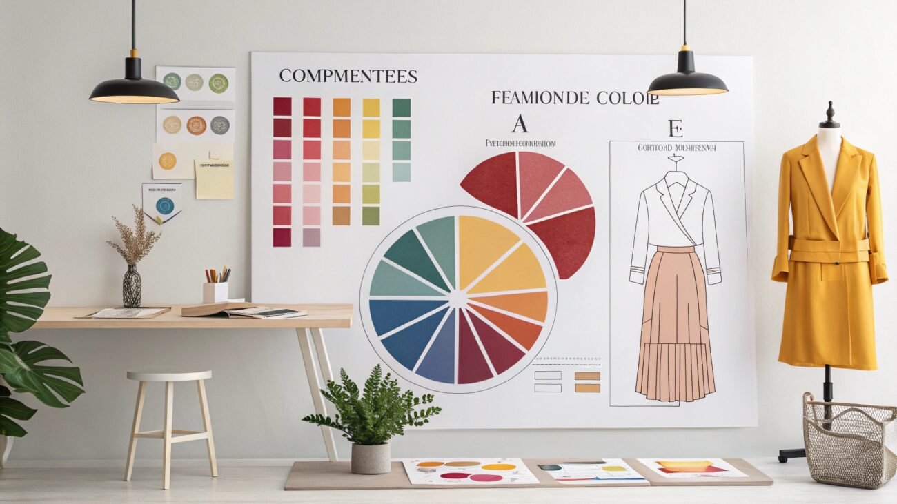
Emotion Range of Basic Color Wheel:
Warmer Tone Colors:
These colors generally evoke strong, excited feelings of energy, passion, happiness and warmth, which is necessary for many garments such as quality energetic T-shirts and Team uniforms where a stride of aggression and unity is needed.
Cool Tone Colors:
This color grid typically conveys calm emotions like trust, stability, trust and wisdom. Designing custom jeans with such colors is a decisive move, as it captures the relation of jeans being sturdier to reliability to cool colors.
Disclaimer: Each color, when even slightly altered, can expand its borders from vibrant joy to deep melancholy or formality. Take hot pink, for example. Usually, it conforms to a high level of excitement, but if we were to add just a little undertone of brown color or reduce its saturation, then suddenly it would feel like a lacking and depressed color. This is why color psychology in fashion is so important.
Main Categories of Colors
There are many categories of color; in fact, it would take forever to mention all color grids due to them being distinct on different yet similar emotion ranges. Understanding associated feel and potential use gradually gets more difficult as color wheels get subcategorized into various shades and pallets of colors.
However, to keep this guide concise and to the point, here are some color types you should be aware of before starting any custom clothing lineup.
Primary Colors:
Colors that have a broad range of emotions and can not be obtained by mixing any colors.
There are three types of primary colors depending on the means of presentation (i.e. Digital mean or Physical).
- RGB color system is perhaps most heard of, it employs the use of red, green and blue colors to make vivid digital art and Garment designs, to find suitable color matching in outfits. RGB colors, when combined, give a black color.
- The RYB color wheel is used by artists to draw paintings and symbols on garments. This system employs the use of red, yellow and blue.
- CMYK color system is used when the actual printing of custom clothes is concerned. CMYK means Cyan, Magenta, Yellow and Key (black).
Now you might be wondering, how does CMYK issue colors like red, brown or even blue? No matter which primary color system you are using, it combines colors in different saturations and brightness to make other colors. As in the case of CMYK, Red can be created by blending yellow & magenta.
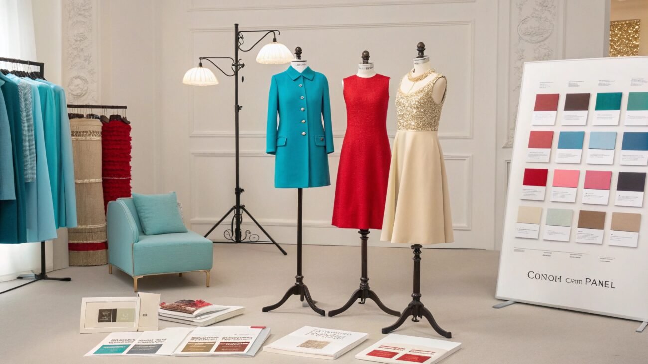
Secondary Colors:
The blending of colors is what gives rise to secondary colors. Imagine, the color orange was not in any primary color system, but how is it made? When bright red and yellow are combined, it gives out the color orange and its shades. When venturing into a world of secondary colors, defining emotions becomes even harder.
Take a look at this table to see what we are trying to say!
| Color | Associated Emotions |
|---|---|
| Red | Passion, Love, Courage, Excitement |
| Yellow | Happiness, Intellect, Creativity |
| Orange | Creativity, Warmth, Vitality, Adventure, Immaturity |
Noteworthy Detail: Orange companies the emotions from both of the original colors but also has its own uniqueness in being adventurous and immature. Signifying the fragility of colors.
- Tertiary Colors: Tertiary colors are even more specific in their expression; they are made when primary colors are mixed with secondary colors. For example, red-orange and blue-green are some color types that fall under this category.
- Factors Influencing Shades of Colors
- There are multiple factors influencing shades, the first being the color’s Hue: It is the amount of vibrancy in color. A red color with higher vibrancy will confer excitement, but when the same color has lower vibrancy, it starts to indicate dangerous and ill emotions.
- The second factor is saturation levels, which means how bright or dull the color will be. Highly saturated colors can sometimes lack excellence and sophistication. While lowly saturated colors give off a feeling of maturity and premium ness.
- The last thing is the value of color, which is calculated by the distance from an absolute black point in the color spectrum. For example, even if hue and saturation are the same, the distinction between red and burgundy is as clear as the difference between the brown of the earth and blue of the sky.
Now, you may be wondering, how to use color theory in fashion? Understanding colors can help you create top-notch trendy clothes. As stated previously, fashion color combinations are what dictate the success or downfall of a garment.
If your envisioned clothes are meant to be highly niche, then going for tertiary colors might just prove to be best for your business. Tertiary colors would ensure a specific targeted audience, but on the other hand, if your business revolves around affordable products, then primary colors with broader emotional ranges are best, as they can target just about everyone.
If you have time on your hands, then we highly suggest you look at the table below to better understand the topic of color coordination in fashion.
| Color Spectrum | Psychology | Best Garments |
|---|---|---|
| Primary Colors | Strongest & Most Direct Emotions | Casual Wears & Statement Pieces |
| Secondary Colors | Lively, Harmonious & Luxurious | Artistic Apparel & Seasonal Wears |
| Tertiary Colors | Specific Moods | Elegant & Formal Wears with Patterned Garments |
What do you see on the table? The primary colors with the most direct feelings are usually best for casual wear like t-shirts and shorts, whereas, for seasonal wear like jackets and lightweight resort clothes, secondary colors are best owing to their luxury and comforting set of emotions.
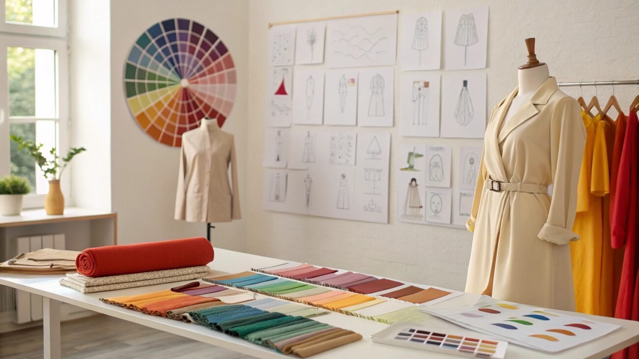
Methods to Harmonize Color Schemes
Understanding how colors interact with each other and how they can effectively complement each other is utterly essential for any brand aspirant. When colors are subcategorized, they fall under relative regions, such as a region of red with its shades.
Below mentioned are ways to combine colors cohesively for fashion designing:
Monochromatic Approach:
This approach uses different shades and tints of the same color to make a cohesive color combination. Higher-grade color wheels are not just subcategorized into different color regions but also into various shades of a singular color.
These combinations are sleek, minimal and professional when incorporated in leggings and jackets.
Analogous Method:
These combinations are created by two or more adjacent colors and look harmonious due to a relatively common hue. Analogous colors are often found in nature, and when applied in clothes manufacturing, they look exceedingly calm and serene.
Complimentary Way:
This approach aims to combine colors from opposite regions; the resulting colors are highly dynamic to look at and are often used in casual wear.
For example, Fluoro t-shirts are some of the most visually striking and serve as a means to showcase personality.
Why are Certain Colors Highly Specific in The Fashion Industry?
There can never be the best color combinations for clothes unless you understand why some colors are precise, meaning no matter how much you try to change them, their underlying emotional field remains the same. Take olive green, for example; no matter how bright or vivid you try to get it, it will always give a feeling of trustworthiness and historical importance.
But why is it so? Consider these Pointers:
- Mood: Each color type has a specific emotion range of its own. Take blue, for example; no matter how bright or vivid it may get, it will never be able to match even an ounce of red’s passion and excitement.
- Brand Identity: Colors are what define the unique perception of brands and make them recognizable. Now think. Can you ever use McDonald’s Red and Yellow in any other way other than quick, trustworthy and hungry? No! Similarly, it is your product lineup and brand that affects the nature of the colors with your value addition of being serviceable and reliable.
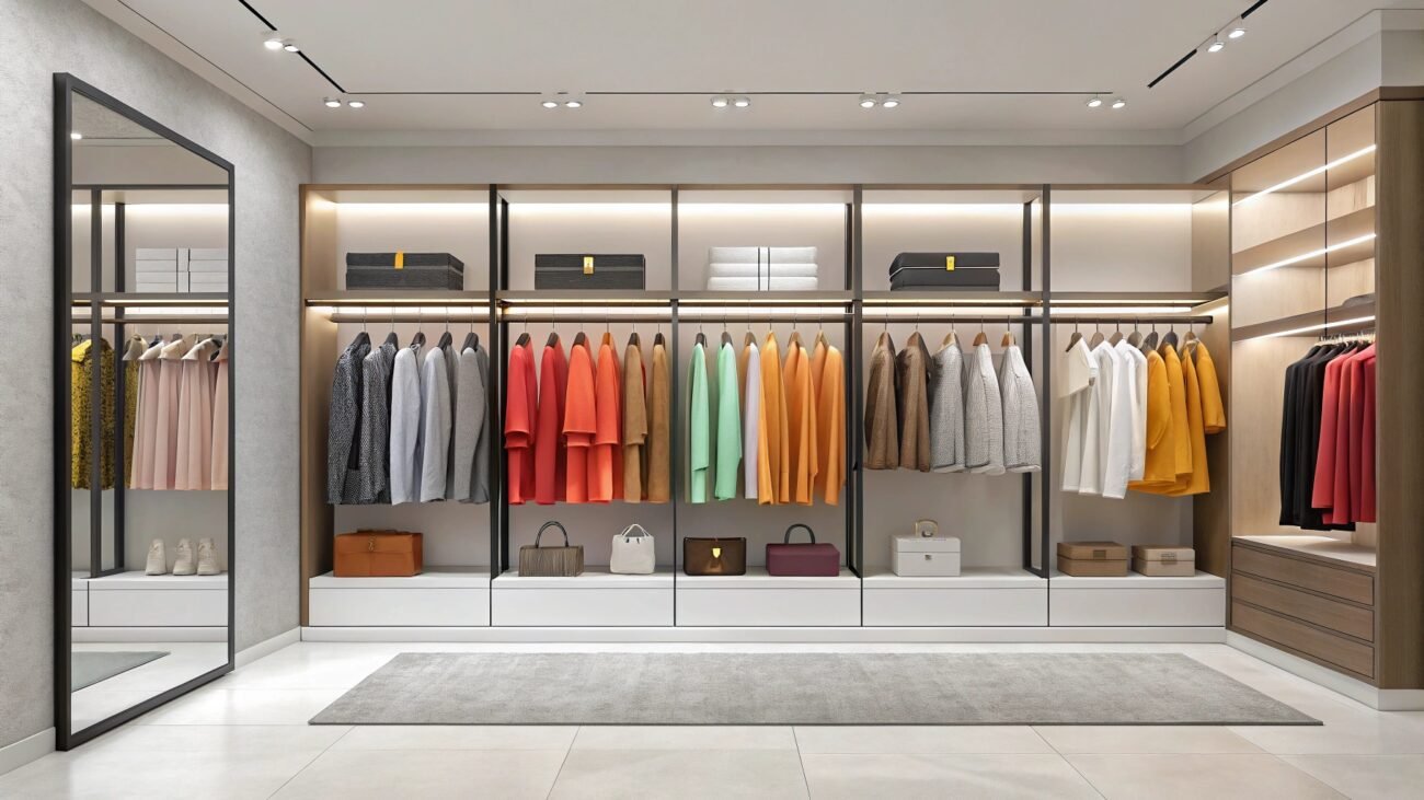
- Garment Types: Certain garments require a specific set of colors, think about it like this: Not everyone is interested in premium activewear clothes, so designers rarely make them with primary colors, which are highly engaging with just about anyone. Only specific colors from tertiary or secondary groups are used.
- What if we use primary colors for activewear?
In that case, there would be no distinction between an athlete and a regular person. So, over time, athleisure might lose its charm, which is not what an active lifestyle would want.
- Trends in the market: Depending on the trends, colors might not shift as strongly as you want them to. Made-to-last sweat shorts are usually made in neutral colors like white, black and grey. These colors right now represent confidence and professionalism. If you were to design them using hot colors, then chances are it would completely ruin the outlook.
Must Read: Highly specific colors are what has made many businesses thrive and exponentially successful. The functional clothing industry and formal wear often tend not to experiment around with different colors as it would defeat the entire purpose of being niche, committed and professional.
Color Theory Wardrobe Guide for 2025
Picking the right color schemes can be a little tricky, as colors vary in their meanings from culture to culture, and your intended audience also plays a massive role in color selection, but consider the following to choose the best color combinations for clothes:
> For Business
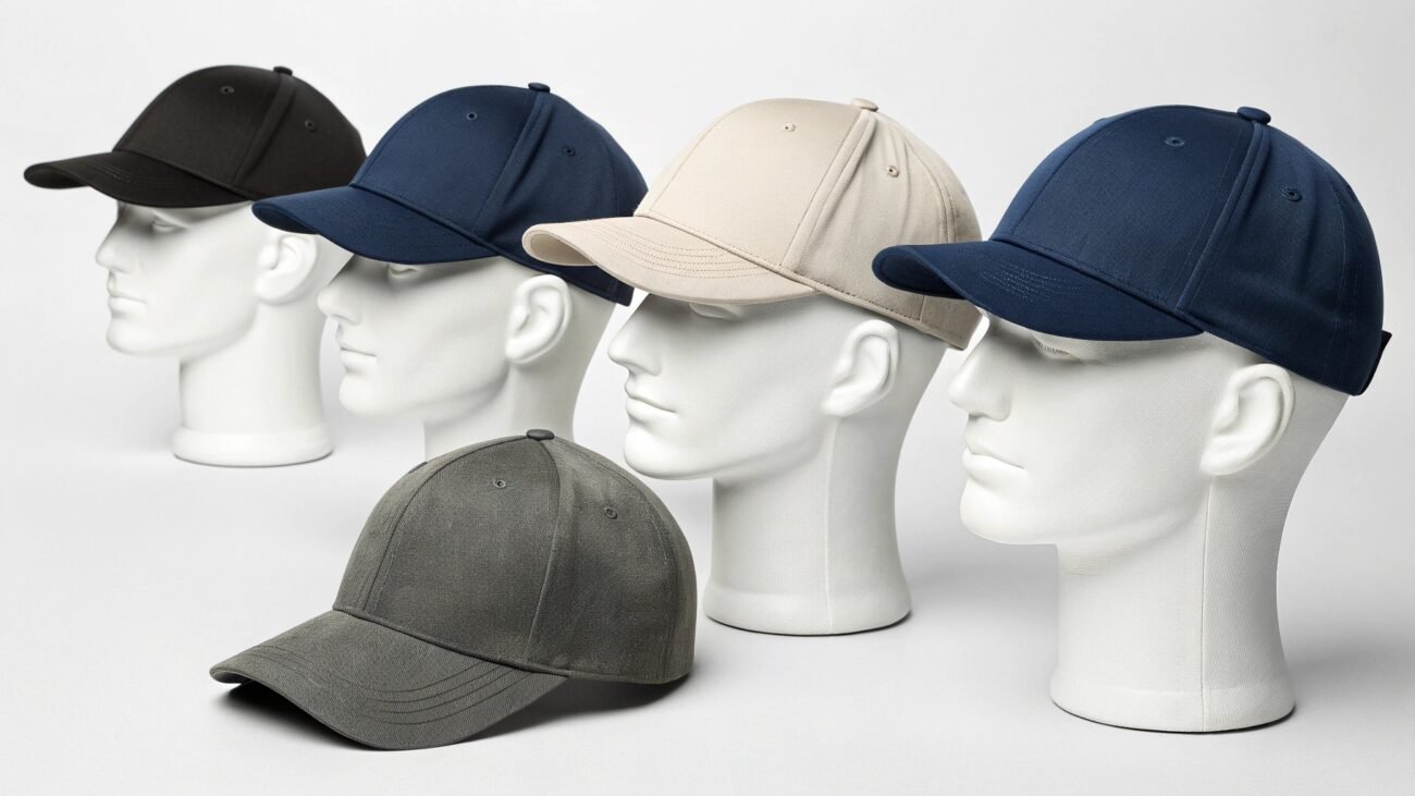
1) Prioritize Neutrals:
Always try to build your foundations with core neutrals. Opting for these colors would ensure a broad range of versatility and will establish your brand as professional and reliable for everyone.
- Neutral colors you can explore:
- Navy
- Charcoal grey
- Black
- White
- Beige
2) Incorporate Color Accents Strategically:
Once your neutral foundation has been laid, now is the time to add accents that can separate your business from other competitors. Opt for cool tones like blue and green to convey a message of trustworthiness and intelligence and warmer colors like burgundy and brick red to add a polished look to ties, scarves and blouses.
3) Consider Your Audience’s Undertone:
If your potential clients have cool undertones, then adding colors like deep purple, cool greys and blues will be the key to a polished look, while colors such as olive greens, warmer red and browns will look flattering on warmer skin undertones.
However, if your audience’s undertone is neutral, then you can experiment around with both undertones.
If you are interested in starting your own private labelling brand then we highly suggest you check out this blog.
Click Here: Unleash Your Vision: How to Start a Private Label Clothing Brand
> For Regular buyers
Choosing a color scheme is about personal preferences, comfort and versatility. Unlike businesses, you are not bound to anything. You can essentially wear anything you want, but if you manage to align yourself with specific guidelines, then you can make an even more upright wardrobe.
You can start by understanding your skin’s undertone; cool undertones look great in blues, pinks and jewel colors, while warmer skin tones look exceptional in earthy colors like reds and yellows. Afterwards, consider what vibe you are going for, as cool colors can induce a feeling of calmness and sophistication, while warmer colors instill the expression of excitement.
Conclusion
Color is the most powerful language of fashion as it can directly influence the appeal of an outfit as it directly invokes sets of emotions that can either deem a garment successful or a failure.
Following down that road, you may think it is a hassle to get into color theory for fashion design, but it really is not. You just have to understand how different colors can mean something and how even slight changes can alter the entire meaning of colors, except for neutral colors, to create a functional wardrobe or custom chic selling business.
Cant Figure Out Colors?
Consider PLCM, we have been the backbone for many successful brands from all over the world. Our policies are highly startup friendly, we offer low MOQs and prices for you ease!
FAQs
1) What is a color wheel, and why do I need it?
A color wheel is a visual tool that arranges colors by their relativity in a widespread spectrum. It helps you understand how colors interact with each other, and quite honestly, without a color wheel, you can not design creative designs in any field, let alone the clothing industry.
2) Which color system do printing methods use?
Printing methods usually use the CMYK color system for subtractive color mixing, which is vital for creating a wider range of color combinations.
3) Can I pair cool colors with warm colors?
Yes, pairing cool and warm colors can create a dynamic contrast, which is very likeable in current trends.
4) How do I create a sound color palette for a collection?
Understanding color palettes in clothing is extremely crucial and creating a color palette for a collection is not that hard, just pick colors that naturally go well together, like different shades of the same color or even colors that are relatively similar in emotions. You can also get color combination ideas from trends, nature or even from artistic painting.