Have you ever thought about how fashion designers create such eye-catching designs? You may think it has to do with patterns and shapes, but really, it has more to do with colors than anything else.
I’m sure all of us at least have some idea of how different colors mean something different; for example, Generally, red means love or care, and green gives off the feeling of freshness alongside pureness, and designers all over the world perfectly understand what that entails.
With the use of handy tools like fabric dyeing color mixing charts, they have designed vogue clothing lines that are not just head-turning but also an expression of your inner self.
Join me till the end to learn how you can even understand basic colors and use fabric dye mixing charts to create your own personalized high-end clothing line.
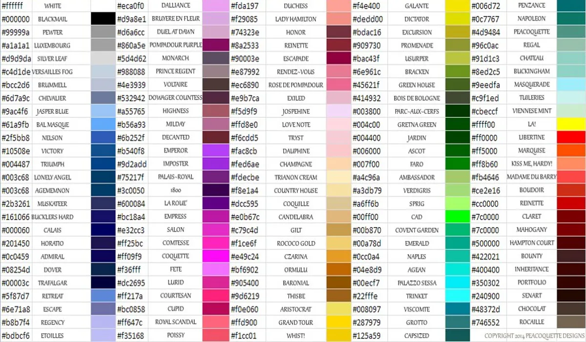
What Are Color Mixing Charts?
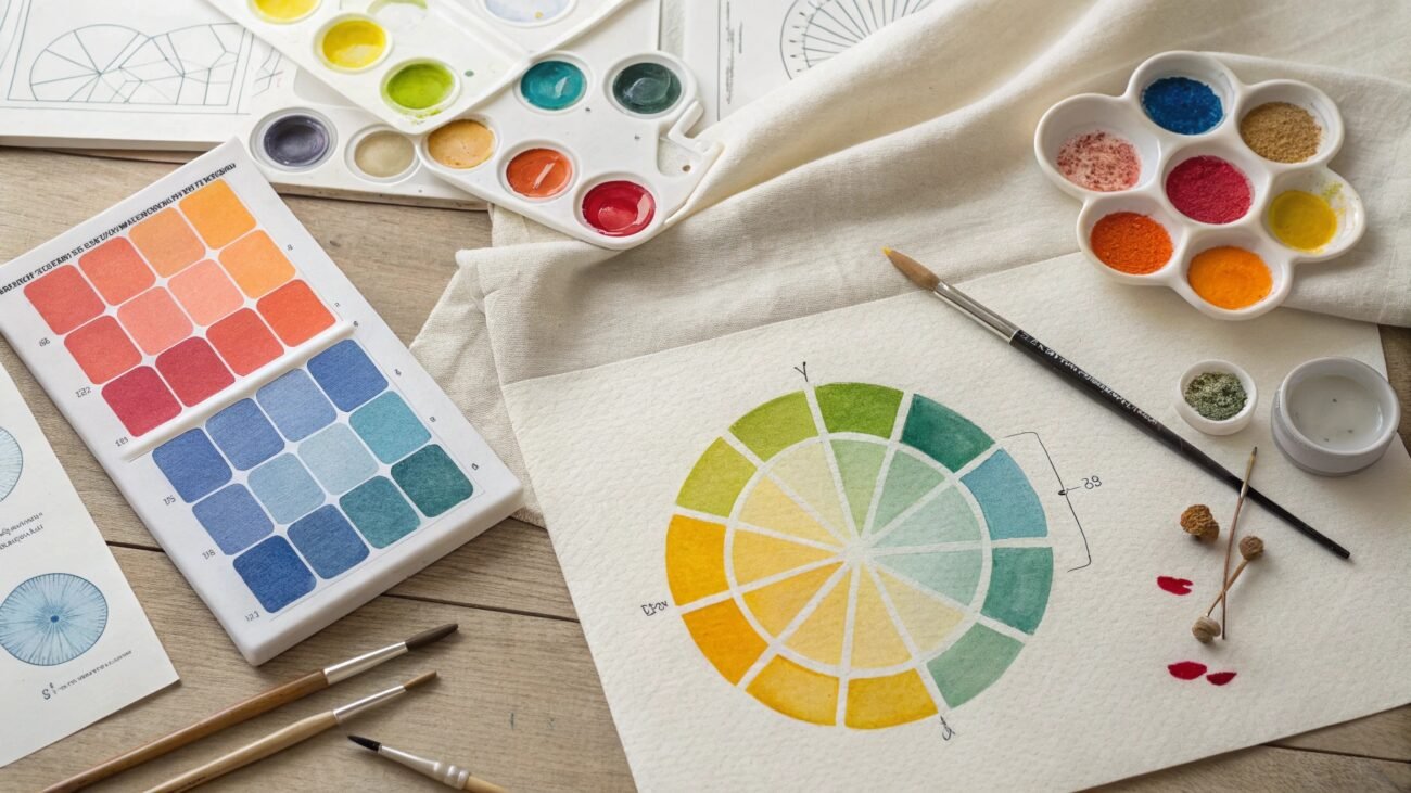
Fabric dyeing color mixing charts are visual tools that help not just clothing designers but also artists to understand how different color combinations can create new ones.
These charts are essentially a type of well-documented guide that tells you how colors behave with each other. Suppose you want blue to be sort of exciting, but in reality, blue is relaxing and sophisticated and gives off a feeling of freedom.
However, with the use of color charts, you can easily make such a shade of blue that invokes excitement and fun.
Common Attributes of Mixing Charts:
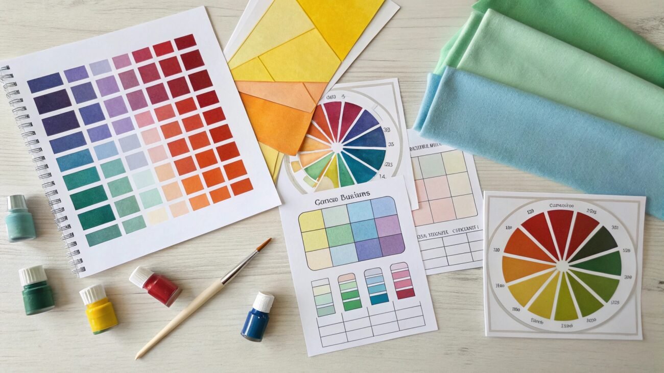
Primary Colors:
These are the most basic colors in every color mixing chart and are unique because they can not be created by mixing other colors. For pigmentation, CMYK (Cyan, Magenta, and Yellow) colors are used, but light fabric dyeing is concerned. RGB (Red, Green, and Blue) colors are preferred.
Secondary Colors:
When 2 primary colors are combined cohesively, a secondary color type emerges. These colors, unlike their predecessors, are a little specific in their emotion-defining characteristics. For instance, when red & blue are blended together, we get a purple color.
Tertiary Colors:
If you want a high niche color, then tertiary color schemes are the way to go. Combining a primary color with an adjacent secondary color gives out a tertiary color. One such example is the use of red with purple to make shades of burgundy and fuchsia.
See how Tertiary colors are different than primary ones:
| Color Type | Red (Primary Color) | Burgundy (Tertiary Color) |
|---|---|---|
| Emotion | Passion & Love | Sophistication & Elegance |
| Energy | Energy & Excitement | Depth & Maturity |
| Power | Power & Dominance | Quiet Power & Authority |
| Symbolism | Danger & Warning | Ambition & Opulence |
Note: What do you see in the table? Although both colors are similar to each other, burgundy gives off a feel of professionalism and maturity red, on the other hand, burgundy is an energetic and excited color, which is opposite to the emotions of tertiary.
- Now, you may have an idea how color mixing can entirely flip the story.
Color Ratios:
This feature is not common, but advanced charts will show you that changing just slight proportions can affect the final hue, saturation, and value of a color. In easier wording, such charts will show colors in percentage, like color red with 75% and yellow with 25%.
Muted Tones & Neutrals:
This has to be the most favored property of color mixing charts, as they allow designers to create neutral and monotonous colors, which are often considered essential in classy activewear clothing lines.
Value Scale: These Charts also let you know how colors can be concentrated or diluted by adding white and black.
Why are they Used?
Color Charts are used for several purposes, ranging from understanding how color theory works to expanding color palettes and ensuring consistency in results. Just imagine how important these qualities are in wholesale orders.
Fabric Dyeing Color Guide For Beginners
I hope you understand basic color theory principles, but if you are still struggling with it, let me suggest a blog specifically written on colors for fashion theory.
- Comprehensive Guide: How to Understand Color Theory For Fashion
Fabric dyeing is a craft that very purposefully uses color mixing charts to create custom designs and colored fabrics by facilitating a multitude of color combinations, and knowing how to mix dyes for fabric can equip you with the right knowledge to even start your own business.
There are several important key steps you should know before starting out:
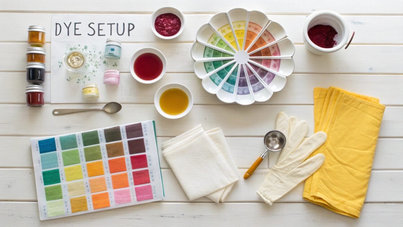
Understanding your dyes:
The very first step in fabric dyeing is understanding how different types of dyes will exclusively work. Yes, you heard that right! There are many dyes in the market right now, each being the best suited for specific fabric types.
> For Natural Fabrics:
Fiber-reactive dyes are often preferred for fabrics like cotton, linen & rayon due to their being vibrant and permanent. These dyes work by binding to individual fibers of material, unlike other dyes, which just work as a color coating.
All-purpose dyes, although less vibrant and noncolor fasting, are best for quick little DIY projects where ease is the foremost concern.
> For Protein Fiber:
Acid Dyes produce brilliant permanent colors on fabrics such as silk, wool, and nylon. They work by bonding to fibers in an acidic environment, where they create a strong bond.
> For Synthetic Fabrics:
Disperse Dyes are some of the most used dyes and are not for home projects! These dyes require high heat to get color into fiber. All-purpose dyes might tint synthetics but rarely dye them fully.
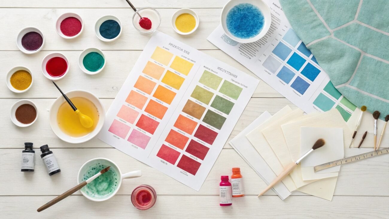
Color palettes: You might think to create unique color palettes, you will need dozens of dye packets, but that is completely a made-up thought. You just need the right primary colors to start fabric dyeing.
Core primary colors needed for dyeing:
- Lemon Yellow: A kind of slightly cool yellow.
- Fuchsia or Hot Pint: Slightly cool red that leans a little towards pinkish/purplish shade.
- Cyan: A type of blue color that has a tinge of green color in it.
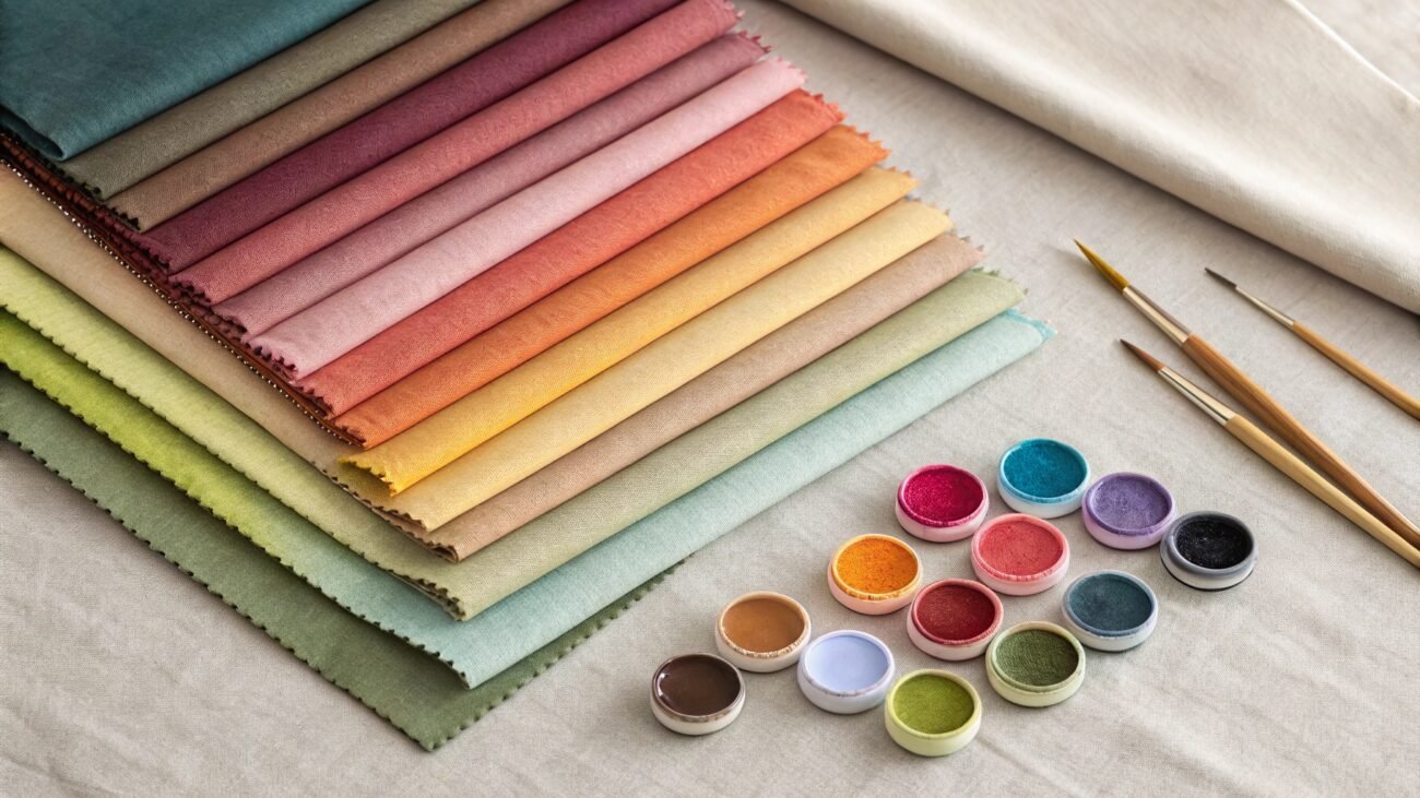
Color mixings: This is perhaps the most exciting step of fabric dyeing, I’m sure you understood core primaries, and now you will learn how to combine these colors to create a rainbow spectrum for your custom clothes.
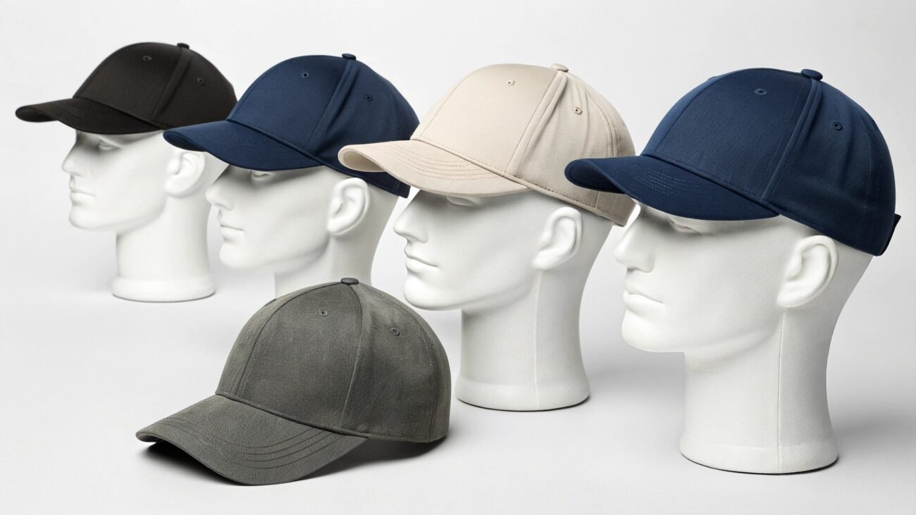
- Yellow + Fuchsia = Oranges (Mixing these 2 gives soft peach to deep tangerine colors, which can be used for several purposes, including making graphic tees and even hats.)
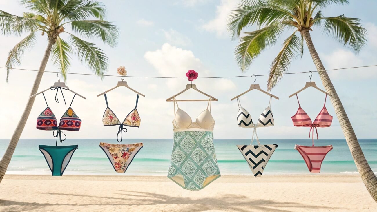
- Fuchsia + Cyan = Purples/Violets (Rich Lavenders to Rich Eggplant Colors, which are excellent for making dresses and relaxing yoga pants)
- Cyan + Yellow = Greens (You can tweak around with different color percentages, but the resulting colors will be in the range of bright lime to deep forest colors.)
Tips for mixing colors:
- Always start out with a small test batch.
- When trying to achieve specific shades, add a tiny amount of secondary colors until you get the desired hue, as you can always add more but can never take colors out of the mix.
- Write down your dye recipes for future reference.
Intensity Control:
The color’s intensity can either be reduced or increased by controlling the concentration of the mixed color batch.
- For Lighter Shades: Add water to reduce the color concentration to achieve lighter hues.
- For Darker Shades: The goal here is to increase the concentration of colors; just remember to use a little amount of water for darker shades of colors.
For Rich Blacks & Browns: One unique fact about primary colors is that they make darker colors like blacks, and by using this combing ability, you easily achieve colors like browns without too much difficulty.
If you manage to understand and apply all these steps carefully, then there is only your imagination limiting you from achieving colors that may have unbound potential either for your personal use or for your clothing business.
Some Trendy Fabric Dye Color Combinations You Should Know!
Knowing how to combine colors and the fabric dyeing process is not enough to personalize your outfit unless and until you also know about current color combo trends. Having options ranging from passionate color combos to ones focused on professionalism will transform your boring wardrobe into a fashion-ready closet.
Here Are Some Top Color Combo Choices:
1) Red + Blue Combo:
If you are living a hippie lifestyle, then bold contrasting colors and blends of red and blues will definitely make an interesting outlook. Blending these colors can give shades like crimson red, navy blue, and azure.
2) Blue + Yellow Splash:
What do you think of when you see yellow with blue color? I don’t know about you, but immediately, a sunny beach comes to my mind, and that’s exactly what these colors are. Dye your clothes with mostly yellow color but with splashes of blue throughout. It will create a lively contrast between vacations and resort wear clothes.
Related Read: The Ultimate Cheat Sheet On Lightweight Resort Fabrics
3) Red + Yellow Colors:
I’m sure we all love sunset, but have you ever thought why? I personally think it is because of those subtle yet vibrant colors of red, yellow, and orange shades. Similarly, clothes made using these clothes, either through color blending or layering, give an unforgettable feeling of nostalgia.
4) The Classic Rainbow:
Rainbow-colored clothes, especially casual t-shirts, and fine fleece hoodies, give them a one-of-a-kind feel. There are multiple ways by which you can get awe-inspiring look for your outfits:
- Spiral Patterns
- Striped Rainbow Designs
- Twist Flamboyant Impressions
5) Purple and Pink:
Remember those summer days when you didn’t have anything to worry about? Color combos of purple, pink, and blue create an illusion of just that. These colors create a feeling of retro lifestyle and will have people notice your ensemble every time you go out.
One fun way of dyeing is to make a vibrant kaleidoscope effect.
6) Browns and Greens:
You won’t believe it, but earth tones have a healing aura that can chip away at anxiety. Just imagine wearing these colors on a dull evening; you will be like a beacon in darkness. For a better appearance, try tie-dyeing with all 3 colors at the same time.
Other Ways to fashion these colors:
- Chocolate browns pair up extremely well with rusty brown, conferring a warm and cozy feel.
- Olive and moss greens create an earthy palette that works with most of the skin tones.
- Pumpkin oranges, when tie-dyed, compliment earthy colors and create a bohemian feel.
7) Soft Pink and Lavender:
There is no room for debate for pastel hues. These colors are extremely popular in women’s clothing and are another color example that goes exceptionally well with every skin tone. Soft pink and Lavender, when combined together, are so versatile that they can be worn as casualwear or even to professional meetings.
Styling Tips for pastel hues:
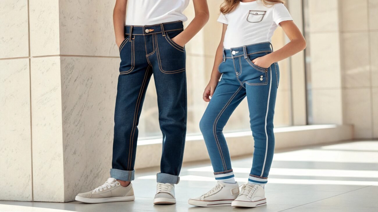
- If you are someone who follows a bohemian fashion routine, then pairing your pastel blouses and crop tops with washed pieces of denim is a power move.
- Alternatively, these colors can also be used on jogger shorts and simple white tees for that laidback look.
Final Verdict: Why Are Color Mixing Charts So Important?
Understanding color mixing charts may not seem very helpful for individuals but for business persons who are selling custom-colored chic. These charts are must-have tools for fashion design.
Having fabric color mixing charts ensures not just consistency, which is crucial for bulk orders or for the brand’s image, but also for saving time. I didn’t mention that before. There is a reason why color charts are so popular, and you might find yourself surprised as well.
Color charts predict your envisioned colors based on combining color choices. Now, take a moment and imagine how useful that is. You may have an idea for color in your head, but what if you waste dye packets to make it? Then it’s not how you imagine?
Color charts save not just time but also your bank balance.
Create Colorful Clothes!
Introducing PLCM, we are your go-to custom clothing manufacturers. Our top fabric dyes choices ensure highest possible qualities for your clothes with a promise of long time durability. We also provide 50 pcs MOQs for startups!
FAQs
1) What is The Tie-Dying Process?
Tie-dyeing is a fabric coloring technique where fabric or cloth is first folded, twisted, or crumpled and then either fully submerged or partially submerged in a color mix. This gives the fabric a unique color-patterned look.
2) What is a Swatch Test in Fabric Dyeing?
Swatch test or lab dip means the use of a small piece of dyed fabric to match color standards. It is crucial because when fabric is dyed, it may not exactly be like what you have imagined. So, it is always considered a best practice to run a swatch test to see how well fabric will take color.
3) What is the Trend of Dopamine Dressing?
Dopamine dressing is a trend of wearing bright, cheerful colors, and the rainbow color scheme fits perfectly in this routine due to it being the very essence of emotions that invoke positivity to elevate someone’s mood.